How To Pick The Right Color Scheme For Your Home Or Office Interior Painting Project
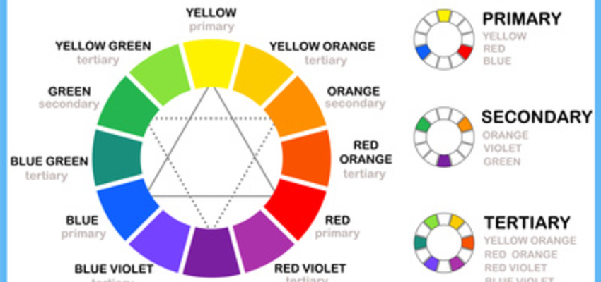
Before the Oliveira Painting Company starts a new project for a residential or commercial client, we provide assistance to help them narrow down the best color combinations for the interior painting job at hand. One of the best tools for this process is the color wheel.
In a recent article by Natalie Rodriguez of ThisOldHouse.com called:Choose Paint Colors With a Color Wheel, Natalie explains how a color wheel is the best way to find colors that complement each other.
Here is a brief summary of the article, complete with featured pictures of examples you can find at ThisOldHouse.com:
1)
Use a complementary color scheme: these colors are always be found at opposite ends from each other on a paint color wheel When put together, they bring out the best in each other, making both colors look cleaner and brighter than if either were mixed with, say, a neutral gray or a different shade of the same hue.
2)
The color wheel is constructed to help you see the relationships between different hues. The bases are three primary colors: red, blue and yellow. These are then combined to make the three secondary colors: orange, green, and purple. Finally, the remaining six colors on the wheel are known as tertiary colors and are mixes of the secondary colors, including such hues as red-orange and blue-green. Familiarizing yourself with the color wheel can help you understand how to best mix and match a cool color with a warm one, for a naturally balanced room.
3)
Below are examples of how to use complementary color pairings effectively:
Red and Green
Green hues brushed onto walls and lower cabinets complement the red tones of mahogany beadboard and upper cabinets.
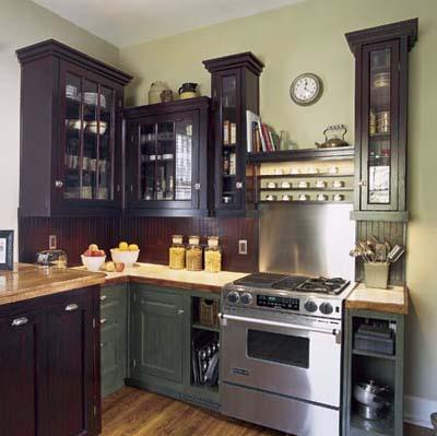
PHOTO BY DEBORAH WHITLAW-LLEWELLYN
Red-Orange and Blue-Green
Energetically bright orange-red towel and glass pop against cool, blue-green walls without overwhelming the soothing hue.
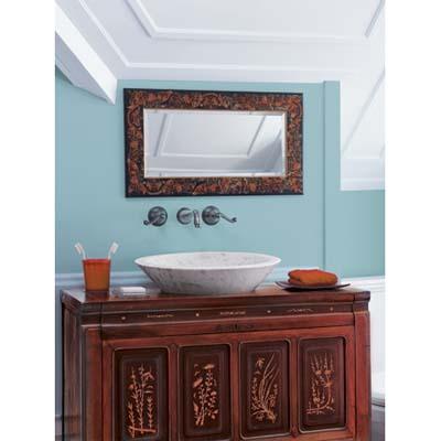
PHOTO BY MARK LUND
Orange and Blue
Cool blue milk paint on walls accentuates the bright burst of orange on the blanket chest in front of it.
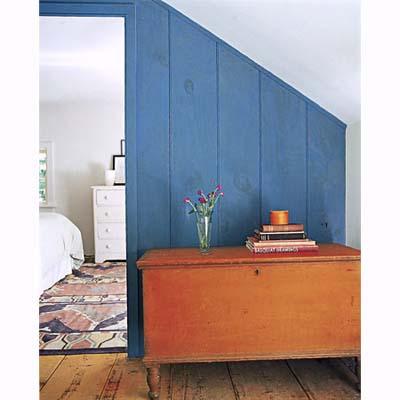
PHOTO BY LAURA MOSS
Yellow-Orange and Blue-Violet
Glossy violet-blue pantry doors in a mudroom pop against the yellow-orange of the adjacent wall.
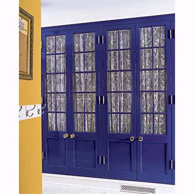
PHOTO BY LAURA MOSS
Yellow and Violet
Yellow window casing and violet countertop show nicely against the neutral beadboard and white cabinets.
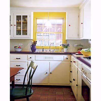
PHOTO BY LAURA MOSS
Yellow-Green and Red-Violet
Pale yellow-green trim and pantry door meet their match in the subdued reddish-violet paint on the walls.
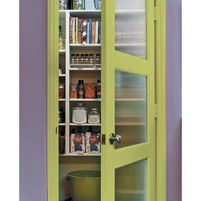
PHOTO BY GREGG SEGAL
As a commercial and residential painting contractor in Taunton, MA, we work with major paint suppliers like Sherwin Williams and Benjamin Moore.
Visit the Sherwin Williams website to use the color visualizer tool at: https://www.sherwin-williams.com/visualizer#/activ...
Or visit the Benjamin Moore website at: https://www.benjaminmoore.com/en-us/color-overview... to use the color finder tool.


